

wanderdog Overview

Click on the image to view the app
Timeframe: 2 week sprint from Learn to Iterate phase.
Role: UX/UI designer
Team: 2 UX/UI designers
Tools: Adobe XD, Photoshop, Illustrator, Overflow, Google Suite, and Keynote
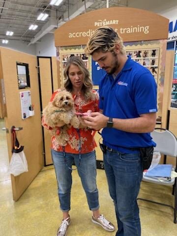
Wanderdog is a line of dog products that are designed specifically for pet owners who enjoy travel and outdoor adventures with their dogs. The pet carriers are the flagship products.
Problem statement: People love to travel with their dogs but it can be difficult to find comfortable, durable, easy-to-clean and well-ventilated travel carriers for dogs. There are restrictions that need to be adhered to with air travel and in 2019 subway travel in NYC implemented a law that requires dogs to be in a bag.
"No person may bring any animal on or into any conveyance or facility unless enclosed in a container and carried in a manner which would not annoy other passengers," the MTA rules stipulate.
the pivot
Initially, wanderdog started off as “poshpooch” - a line of European-inspired dog bags. After conducting the 1:1 interviews though it was overwhelmingly clear that people wanted a more utilitarian style of bag for their dogs. Still stylish however it also had to be easy to clean, durable, comfortable to carry, and well-ventilated. Having a luxury dog carrier with high-end materials didn’t offer all of these desired criteria so there was a pivot and wanderdog, dog products built for adventure, was born.

An early draft of the initial poshpooch concept
Competitive Audit


A splash screen is a source of brand strengthening

Card scan, and appropriate keyboard pop up, makes data input easier
From the audit of several sites within and outside our business vertical, we discovered features we really liked and wanted to implement. The full audit can be found here.
Micro-interactions in forms are something we wanted to include. As you type in a field, the label moves up and reduces in size to allow space for the text being entered. By using micro-animations the user gets support in understanding the hierarchy so elements are placed in context. This creates focus. The user gets a sense of direct manipulation because it sees something happen directly.
A carousel allows for fitting a lot of content into a relatively small footprint. Important information derived from interviews is showcased within a carousel.
The ability to scan cards versus having to manually input info is a better user experience.
Ninety percent of information transmitted to the brain is visual. Adding a splash screen to an app works as an opportunity to stick in the minds of users.
Social Listening
We do social listening in order to connect with our customers requirements and deliver a well designed product they will enjoy.
Source: International Business Times. Oct 22nd
Source: National Geographic 2017
Data Analysis

47% of Americans own a dog
Source: American Pet Product Association 2017

TripAdvisor found that 53% of respondents travel with their pets. (1,100 surveyed in 2017)

43% of people choose vacations with their dogs that include fresh air and lots of hiking
We were interested to find out that 15.4% prefer going to a dog-friendly beach, 18.3% want to check out a national park or historic site, 12.5% opt for a hotel in a pet-friendly city, 43% look for a destination with fresh air and lots of hiking, and 10.8% choose other types of vacations.
Source: blog.gopetfriendly.com (2018)
Persona
The persona represents the type of person that would use our app.

Sitemap

User Flow

Sketches
Paper sketches provide designers with an inexpensive way to visualize and test out as many ideas as they can.


Wireframes
In the Design phase there are many iterations with each step. Here is the first version of wireframes:

Moodboard

Mockups


Experiment
My partner, Hae-Yang and I tested the sketches, wireframes, and prototypes with friends and people in the community who were all dog owners.
Interview Questions:
How many dogs do you have?
ANSWER: 4/7 had 2 or more dogs the rest had 1.Do you shop online?
ANSWER: 7/7 shop onlineDo you understand what this app is for?
ANSWER: 7/7 understood it was an e-commerce app to purchase dog products.Do you know what wander means? (It means to browse)
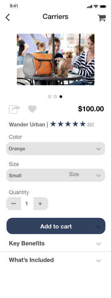
ANSWER: 0/7 understood that it meant to browse the app. That they could look without registering or signing in.Can you purchase a Wander Urban carrier?
ANSWER: 5/7 could get from the PDP page to checkout without promptingWhat do you think these are for? (drop downs)
ANSWER: 7/7 could recognize when there was a drop-down with more information to reveal.Did that do what you expected? (keypad)
ANSWER: 7/7 expected to see a text or numeric keypad pop up when filling out a form.What doesn’t work?
ANSWER: I don’t know what “wander” means, the pop-up that says “Added to Cart” is annoying, the bone-shaped search field is “cheesy”, and the dog icon for the “account” page in the persistent nav isn’t obvious. Even though it’s a dog product app, a silhouette of a human vs. a dog would be more understandable. Recognition over recall! Add more white space overall.Would you use this app?
ANSWER: 7/7 would use the app over Amazon or other big box stores because the products have been specifically made and tested for travel and extensive wear and tear.


The wireframe testing feedback from question #8 indicated that the highlighted areas above needed to be addressed for the next iteration.
Iterate
Removing the hamburger button
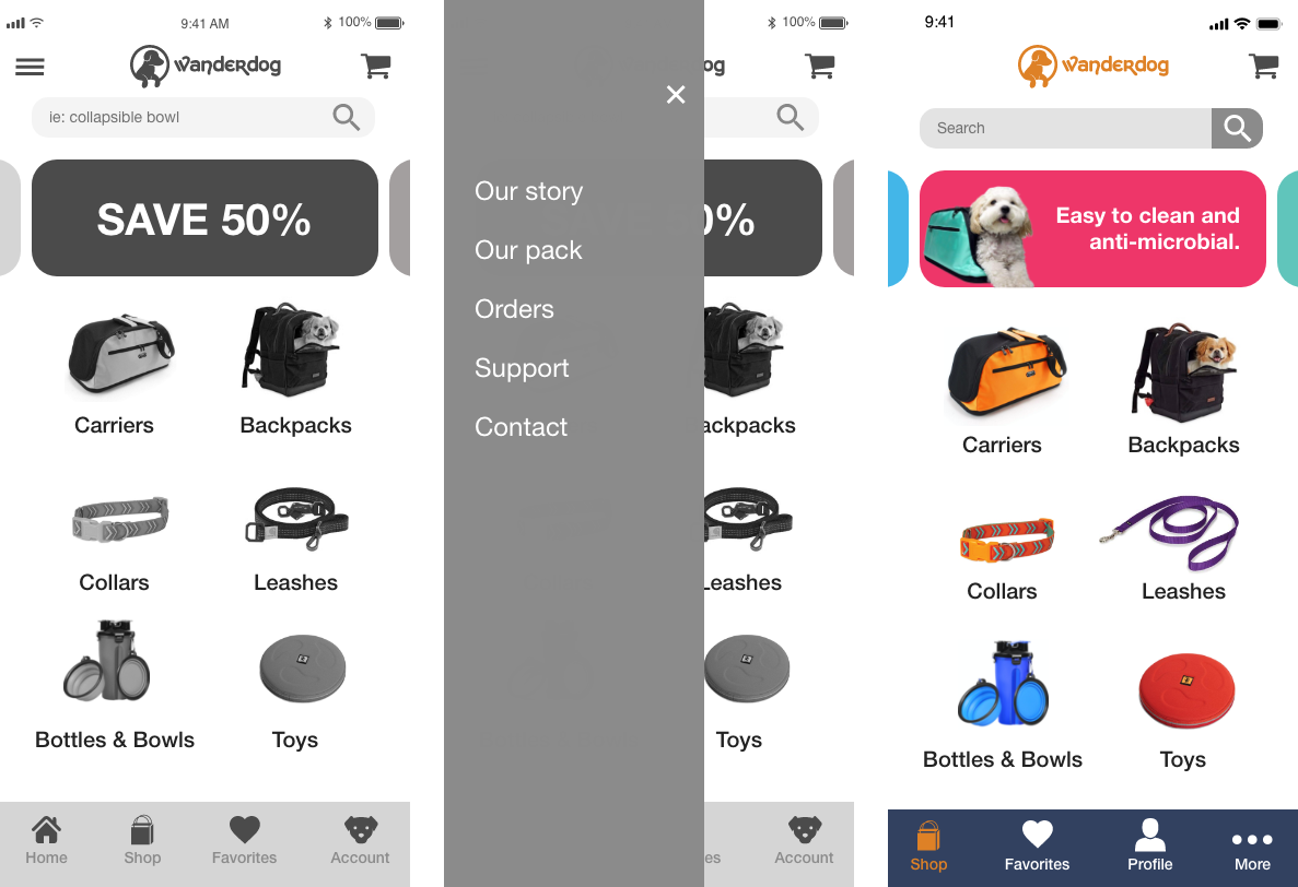
I got rid of the hamburger button with the side fly out menu because I found that it was taking more of the user’s time to navigate around the app. Also as phone screens have grown bigger each year, the top left corner is the hardest place to reach on a mobile device especially for a right-handed user, and it doesn’t exactly encourage engagement.
Changing the carousel

The carousel content changed from highlighting rewards, sales, and prizes to highlighting what our survey results indicated as being the most important attributes of a pet carrier - easy to clean, comfortable, and durable.
Shopping cart revamp
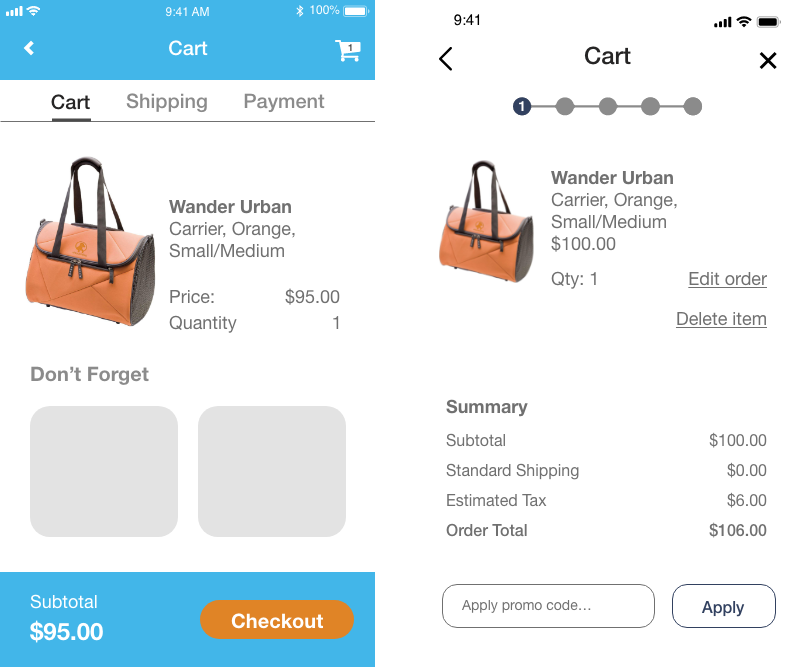
In the updated version on the right I added a progress bar to minimize user tension by providing feedback on what is happening. User controls and summary of the order also reduces user tension.
Simplifying checkout

Being able to checkout as a guest is really important to avoid cart abandonment. 34% cart abandonment is due to the site wanting the user to create an account. Being able to see the password is also an important feature to have to help avoid user error.
Creating order out of the order review

In the update I itemized costs, shipping and despite being so close to making a sale, I added the emergency exit. User must always be in control of what they are doing.
Ensuring the good-bye will incentivize more buys
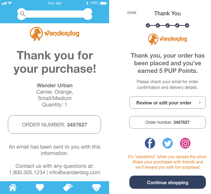
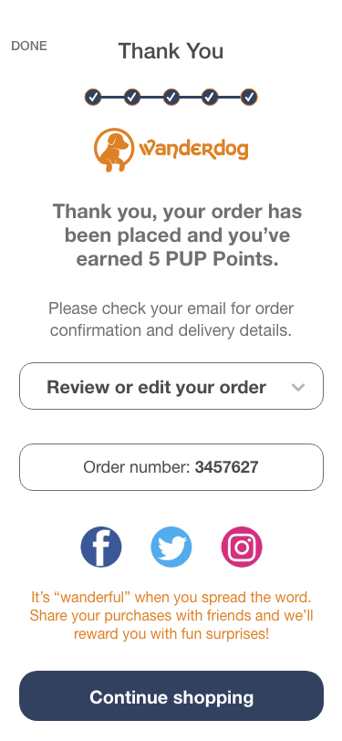
To get customer information you can see in the updated version that users are required to sign up to participate in the rewards program. The review/edit order button is a last chance that offers freedom and flexibility to the user and error prevention. Thank you pages confirm the order has been processed. Including social sharing is free advertising and incentivizing with rewards is good for customer retention.
launch

As a team, we needed to align on standard naming conventions, set processes, and create a design system to improve efficiency and deliver consistent experiences. We didn’t just throw the files “over the wall” and forget about it. We still needed to sit together with the developers and communicate more, solve problems together, build on each other’s strengths, and use tools such as a DSM to drastically reduce the time to ship.
We asked our devs how they would combine existing components to solve the problem and it was surprising how quickly they could assemble a mockup!
Prototype of final version
This video shows a tour of what the e-commerce app looks like from the splash screen all the way through to purchasing a carrier.