odd jobs Overview
Team: 2 UX/UI Designers & 4 Web Developers
Time: 3-week sprint
Problem statement: We discovered that people who use contracting sites are frustrated by the lack of customer support and excessive fees.
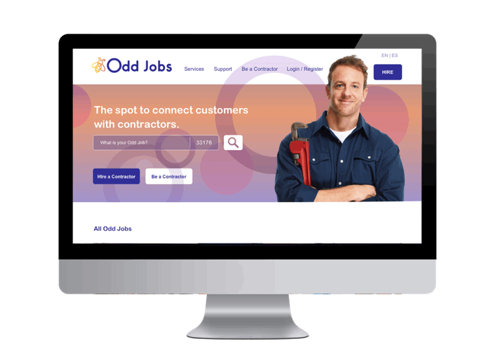
“Odd Jobs” is an e-commerce desktop marketplace that matches freelance labor with local demand, allowing consumers to find immediate help with everyday tasks, including cleaning, moving, delivery, and handyman work with a focus on great service and customer support.
Tools Used


Framework
The framework has several phases that are based on Lean UX. We think, we make and we check. It’s a way to apply iterative methods to UX design. We defined our phases and went through several iterations between the Create, Interaction and Modify phases. Once we did that we had the tasks and data to determine the way to create a clear path for a positive user experience.

This phase is where we conduct research to better understand our users and what they need
Survey

38 respondents
Based on our survey people overwhelmingly valued customer support and reviews when hiring a contractor from a website. We included Support in the global nav as well as reviews on the home page and on the contractor description page.
We also found out what people liked to hire contractors for and grouped them according to most popular to least. With this data we made sure to have the most popular services offered appear on the home page as well as in the top position, above the fold on the Services page.
Social Listening

“...looks like professionals don’t want to answer because they get charged.”
“...I have tried to contact customer service only to be told the call volume is too high and they can’t talk to me.”
The majority of our social listening was gathered from the reviews on TaskRabbit, Thumbtack, and Angie’s List. It showed that people are not happy with customer service and fees are a big blocker in both customer and contractor satisfaction. Also, people rely heavily on reviews.
“97 percent of consumers consult reviews while 85 percent of consumers seek out negative reviews before making a purchase. - Business Wire”
“I would love it if you would respond to my customer service request...”

Data Analysis
70% of people we surveyed stated that customer support is the most important criteria in a hiring website.
73% of people surveyed by Zendesk stated live chat is their preferred method of communication.


Zendesk 2019 eDigital Customer Service Benchmark survey of 2000 consumers
70% of consumers say they have already made a choice to support a company that delivers great customer service. - American Express
54% of customers have higher expectations for customer service today compared to one year ago. This percentage jumps to 66% for consumers aged from 18 to 34 years old. - Microsoft
By 2020, more than 40% of all data analytics projects will relate to an aspect of customer experience. - Gartner
91% of 18-34 year olds trust online reviews as much as personal recommendations. - BrightLocal
Competitive Audit
We audited 20 different sites that were from the e-commerce and social space. From this we established what key elements we wanted to incorporate in our site and what we should avoid.
Takeaways:
From the audit we confirmed that we would include:
A GPS API to immediately determine if you are in an area of service
Confirmation windows after you have completed a task (ie: registration, payment, referral)
A progress bar that tracks the duration of the project
Accordions that need options selected from them before you can move to the next step (Booking the time and frequency for a contractor to work)
Locked content reserved for registered users to help drive them down the funnel
Pre-populated options to avoid user error (ie: search field, the form)
A chat box in the support page that differentiates itself from the competition by being bilingual and 24/7
Sticky nav for the top and side content you want to remain static
Value propositions on the home page to help add credibility and instill confidence
Native pay options
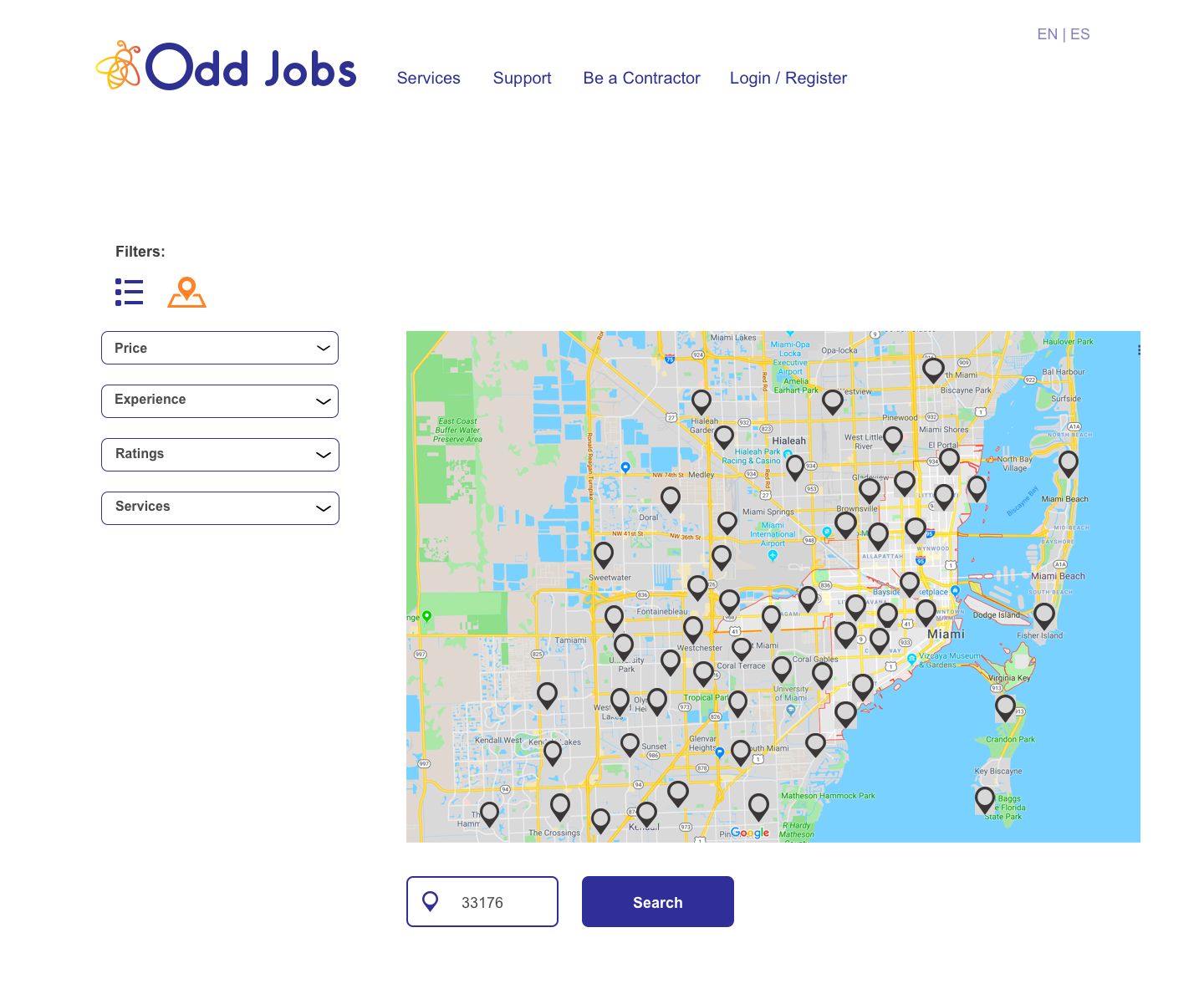
A list/map toggle view for viewing contractors
Rewards and referral program (90% of consumers trust in companies and services recommended by friends, relatives or people they know. Only 33% trust ads) - Nielsen
”Refer-a-friend campaigns help brand’s gain trust since the referrers have already tested the product or service before referring them to their friends. This places refer-a-friend campaigns among the top of the most effective marketing strategies.“ - Businesstocommunity.com

A progress bar that tracks the duration of the project

73% of people surveyed by Zendesk stated live chat is their preferred method of communication.

Rewards and referral program (90% of consumers trust in companies and services recommended by friends, relatives or people they know. Only 33% trust ads)

We will avoid doing this. Visually there is a lot going on and all the buttons have the same treatment. There isn’t an immediately evident CTA.
Persona
The persona is the character profile of someone who would use our site. The data from our survey indicated that the majority of respondents were female, 20-40 years old.

User Journey
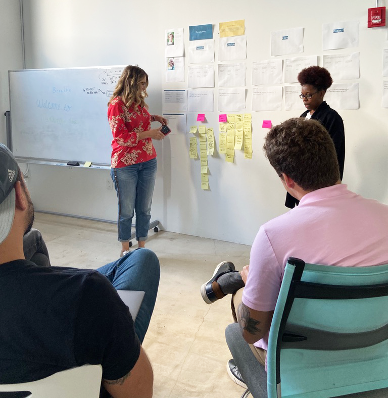

The user journey session was really fun. We collaborated with our web developer team and applied the hyper island methodology to discover the features we wanted to include in the site. Hyper Island focuses on collaboration, and ideation. It’s an no-judgement, brain storming session where everyone is on a level playing field and no idea is a bad idea so this fosters a very safe and creative environment that produces a lot of ideas. The objective of it was to generate features that would help the user interact with the website in the most positive way.
The user journey fosters a more user-centric approach to product design, which ultimately leads to better user experience.
Minimal Viable Product
The Minimal Viable Product is another group session where we review our features and vote on what we must have, could have, should have and won’t have. MVP builds are tasked with learning as much as possible about the features required by users.
We also voted on and determined the Key Performance Indicators (KPI) and voted on features that directly ladder up to our KPI’s. In our case they were REGISTRATION, CONVERSION, RETENTION. Rather than producing a fully-featured product, which addresses the needs of every possible user type, MVP builds are designed to create the absolute minimally viable product—one which creates the smallest feature set that someone would pay for, or even just use.


Sitemap
The sitemap is the structure that shows us what we want to incorporate into our website and how one page will lead to another.
UX Strategy
UX Strategy is a plan-of-action on how to find out if the user experience of a product is aligned with the business objectives. It is used to create an understanding between designers and the goals of the product.
Our strategy was to address the needs to have a hiring site that is SUPPORTIVE, AFFORDABLE and CREDIBLE.

This phase involves the design of the entire process of acquiring and integrating the product, including aspects of branding, design, usability and function.
Sketches
Sketching is a powerful process to use because it always helps discover the best ideas and solutions to a design problem. By user testing your sketches you save time and money in the long run.

Wireframes
Wireframes are a visual guide that represents the skeletal framework of a website. It is like a blue print for our website. Wireframes are always in black and white so when the user is testing it, they can focus on the interface and not get distracted with the colors.


This is the phase where the project starts to come to life. Color is introduced, testing and iterations are happening and a functioning version of the site is created in prototype form.
Testing


We tested our designs at Home Depot, Barnes & Noble, Starbucks, with Wyncode peers and friends and family.
9 people were interviewed. Some of the feedback from 5/9 people thought it was a training site because the words “Become a PRO” were being used versus “Contractor”.
The search box initially said “What’s on your honey do list?” to coincide with the branding of the bee logo however not everyone understood the idiom.
Progress bar was changed to reduce the amount of steps. involved 7/9 people thought it was too long.
6/9 people were fine when they saw the locked profiles and understood why registration was needed to unlock them.
5/9 people wanted the carousel of services removed from the home page in favor for static tiles.

Mood board
A mood board helps to get all stakeholders get on the same page for the visual aspects of the project. They set the theme for the color palette, fonts, iconography and style of photography for the project.

Mockups

Four different home pages were tested and 7/9
preferred the plumber on the textured background.
Three logos were voted on and the bee next to the “O” won favor. In testing 4/9 people thought the other two logos said “dd Jobs”. The “O” was getting lost by the bee and the solid dot was not reading correctly as a letter.

Final version

Sketch, to wireframe, to prototype took several iterations

Side Nav
In the contractor’s profile page the side profile info and header are persistent. This “sticky” nav has been show to significantly improve the customer experience, as well as keeping users oriented and giving them more control.
Persistent Nav
Persistent nav with popular services, reviews and value propositions that reassure the user it’s a safe site.

Form
Our forms follow the best practices from Luke Wroblewski - Product Designer at Google. We incorporated:
- Top aligned field labels for ease of scanning
- Consistent field length
- Relevant content grouping
- Good alignment and vertical spacing


This is the phase where hand off occurs to the developer. The InVision site link, the DSM and photography is all put into a common repository, labelled and organized.
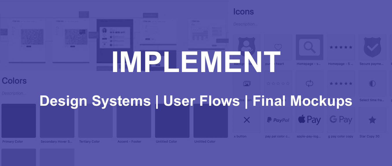
Design system
The hand-off is the unified source of truth. It gives the developers everything they need to design the project. Below is a shared Google drive folder with links to everything they needed to start coding.


Inspect in InVision simplifies the design-to-development process. With Inspect, we could provide the developers measurements, colors, and assets for desktop and mobile prototypes so they generate real code for any design element.

User flow
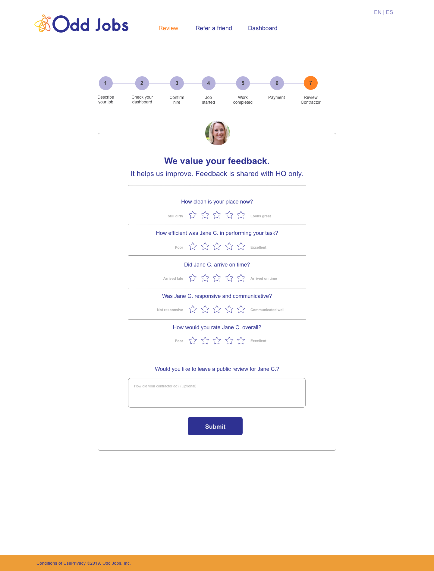
This is the path the user takes to hire a contractor, follow the project from start to finish, pay, provide a review and if they like, refer a friend.
Lessons learned
Being oblivious to our unconscious biases. We need to be careful about the decisions we make that impacts many. I was certain that the map view to see where contractors are located was a waste of time and resources. I was convinced that the area code selected by the user and the distance chosen would be sufficient, however from user testing it was strongly favored to have the map feature. People like to visually see where the person they hire is coming from.